

Loading…
If you can’t explain it simply, you don’t understand it well enough
—Albert Einstein
When business analysts and data scientists aren’t busy slicing, dicing, and modeling vast amount of data, they are busy trying to effectively communicate their findings to decision makers.
And that last part is the hardest!
In order to effectively communicate relevant information extracted from data, there has to be a perfect combination of the right charts and the right story. This is where most analysts get it wrong. Either there is too much data in the presentation to come to any conclusion, or the findings are misaligned from the business.
This two-part series will explore different charts and graphs that analysts can use, and how they can develop storytelling as a skill.
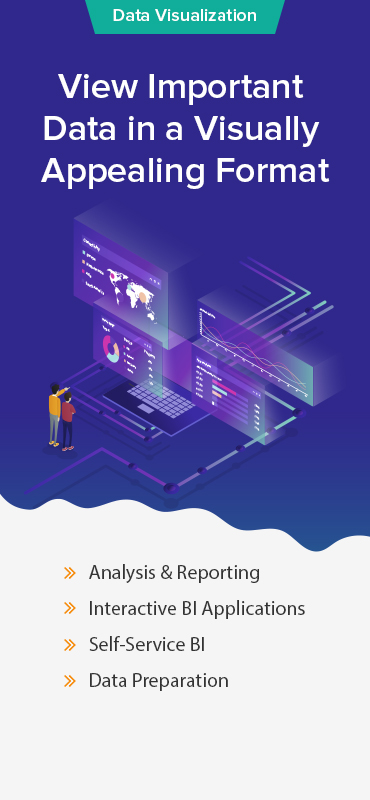
In this part, we will focus on charts that can be used for analyzing and presenting data. Let’s take a look at what charts you can use to present your findings in an effective way:
Column
One of the most common types, column charts are used to show a comparison of items over a period of time, or even a comparison among different items.

When creating column charts:
• Add color to bars to increase the impact. Overlying colors provide immediate insight and allows the viewer to quickly compare information
• Use these charts only when you have data that can be split into different categories
Bar
A bar chart is simply a horizontal column chart which should be used when the data label is long or you have a lot of items to compare.

When creating bar charts, follow the same tips as mentioned for column charts.
Line
Line charts, along with bar charts, are one of the most frequently used charts. They help connect individual data points and reveal trends over time.

When creating line charts:
• Use only solid lines
Kick Start your Sales Analytics with Tableau Templates for Salesforce!
Download your FREE Copy
Dual Axis
A dual axis chart contains a shared X-axis and two Y-axes. These charts are useful when you want to visualize a correlation between three data sets.

Source: Tableau Expert
When creating dual axis charts:
• Primary variable should be on the left side because we are naturally inclined to look to the left
• Use contrasting colors for the data sets
Pie
Pie charts are used to show the numeric proportion of information, which is represented in percentage. The sum of all segments in a pie chart equals 100%.

When creating pie charts:
• Use them only to show proportions
• Make sure that the slice value adds up to 100%
• Limit the number of slices to single digits. If you have more proportions, consider using a bar chart instead
Map
When you have location data, maps are a great way to chart out that data. Maps can be used to show geocoded data like number of accidents by zip code, sales and export-import by country etc.

Source: Apandre
When creating maps:
• Use maps as a filter by combining them with other relevant data and then use it to drill down further into your data
• Layer maps with bubble charts to show the concentration of data. This helps measure and interpret the geographical impact of different data points
Scatter Plot
Scatter plots are a great way to uncover how different pieces of information relate to each other. They can also be used to show distribution trends, and are effective when looking for outliers.

Source: Plotly
When creating scatter plots:
• Add a trend line to make the correlation in your data stronger, but limit the number to two so that the data is easy to understand
• Add filters so that you can drill down into your data
Area
Simply put, an area chart is a line chart with the space between the x-axis and the line filled with a color. They are helpful for analyzing overall and individual trends.

Source: Interworks
When creating area charts:
• Make your charts easy to read by not displaying more than four categories
• Use transparent color so that the information isn’t cluttered
Bubble
Bubble charts are similar to scatter plots but contain a third data series which is represented by the size of the bubbles. If your data set contains three data series, consider using a bubble chart instead of a scatter plot.

Source: Threestory
When creating bubble charts:
• Use circular shapes
• Size bubbles according to area
Stacked Bar
Stacked bar charts are great when you have a number of different items that you want to compare.

Source: VizWiz
When creating stacked bar charts:
• Use contrasting colors for clarity
Heat Map
When you want to compare data across two categories, a heat map is an excellent choice. It lets you compare data using color and lets you see the strongest and weakest categories in your data.

Source: Stackoverflow
When creating heat maps:
• Vary the size of squares to show a third element, like the size of bubbles in a bubble chart
• Use a single color and saturate/desaturate to show changes
Bullet
Bullet charts are great when you have to track progress towards a goal and compare a primary measure to another one.

Source: Interworks
When creating bullet charts:
• Highlight the progress of your data by using contrasting colors
• Combine bullets with other charts in your dashboard to show progress
Histogram
Histogram charts are used when you have to see how your data is distributed across groups. By grouping your data and plotting it on vertical stacked bar charts, you can see the distribution according to different categories.

Source: BreakingBI
When creating histogram charts:
• To make sense of different groupings, create a variety of histograms to determine the most useful groupings
• Let users drill down into different categories and explore the data with a filter
Need help with customized dashboards and reports?
At Grazitti Interactive, we have a team of dedicated data scientists that help businesses with interactive dashboards and reports, which facilitate strategic decision-making. We have assisted companies like Alteryx, Marketo, DealSignal etc. with their business intelligence and visualization needs. For more information about our services, shoot us an [email protected]
Popular Blog Posts
-
Data Lake vs Data Warehouse: Which one should you go for?
-
Top 5 Reasons Why Tableau is Leading the Business Intelligence Industry
-
How to Leverage Data Layer with Google Analytics
-
Driving Effective Revenue Cycle Management Analytics for Healthcare
-
Choosing the Best ETL Tool
-
Data Warehousing and its Challenges


What do you think?
1 Like
0 Love
0 Wow
0 Insightful
0 Good Stuff
0 Curious
0 Dislike
0 Boring


